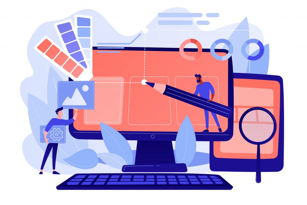
WEBSITE DESIGNING
The fundamentals of design can be applied over a broad spectrum in day-to-day life, from packaging to designing a video game or a website. For any IT company displaying their content, their designs need to capture attention of the clients and once they draw their clients in, it is solely upon the content or products to hold their interests.
- What is website designing ?
That being said let’s dive into website designing . Web design, as we call it, is a largely innovative role and is a quintessential skill in today’s fast paced world. You only have few seconds to capture your client’s attention and you gotta do it the right way! It includes exclusive planning and executing the look of your website, which comprises of determining the website layout, color scheme, text styles, user interface design and sometimes content creation. Layout refers to the structure of the website and how it is to be categorized. A good web design should be user-friendly and should be able to create a brand of it’s own. A web designer must cater to the needs of it’s target audience which means only putting up information that is simple to decipher and relevant.
From the giant monitor to the smart watch , there are numerous sources from where users can consume content today. Web designers are looking for bridging the gap between screen sizes and has come up with two different options for their design. One is Adaptive site and other one is Responsive site. For someone without prior experience, the boundaries may seem blurred but here let’s take a close look at both of these.
- Types of web design format :-
- Adaptive Web Design :-
A web designer have to create layouts for multiple fixed layout sizes with Adaptive designing. The website detects the size of the end user device and chooses the best fit layout for the device ; resizing the content without impacting the design.
In adaptive design, web designers are required to develop designs for the six customary screen widths :-320 pixels, 480 pixels, 760 pixels, 960 pixels, 1200 pixels and 1600 pixels.
Adaptive design was introduced by web designer Aaron Gustafson in 2011. Technically, websites are created by CSS(Cascading Style Sheets) and HTML. The layout and structure can be designed with the help of HTML.
When you choose adaptive design, you can reap the following benefits :-
- You can deliver the content at your targeted audience’s connection speed and location.
- Only the layout needed for end user device will be loaded making the page load faster.
- Adaptive design lets you to re-design your existing website from ground-up because starting from bottom sometimes isn’t an option.
Here are some disadvantages that you must keep in mind :-
- Adaptive design is very labor-intensive and expensive. If the IT company you’re designing for, can afford such expensive maintenance, then only choose this design.
- Since you have at least 6 versions of the website, you need to update each of the version individually, which is time-consuming.
- Responsive Web Design :-
Responsive design uses a common layout for a website and responsively tune to user end device . Responsive design show contents by checking the available space in your device and once detected, the content will be optimally arranged henceforth. It is fluid because it seamlessly works on one web page and from there, one can consume content in their handheld devices as they would on their giant monitor.
Responsive Web Design have the upper-hand in these :-
- The resolution will be adjusted by using media queries to determine what adjustments must be made, which makes the user happy knowing all the content will be translated to the device.
- It is easy to set up and minimal expenses are spent on it’s maintenance as you can organize all of your content in one centralized device.
- Websites that are designed by responsive Web Design are search engine friendly.
However, it is essential to keep these in mind too :-
- The top most concern of responsive design is the load time as it loads information for all the devices.
- Anything other than your content, will be rearranged as it will be loaded into various devices.
- Things to keep in mind while designing a website :-
- The website should avoid non-responsive interface
- Irrelevant information and photos should be avoided at all costs.
- Websites should be simple, the user shouldn’t forage for any buttons or information here and there.
Too much work, yeah ? Don’t worry, you can get your custom-made website from any freelancer or any IT agency which provides solutions and builds websites. Costing may vary, as it will depend on the complexity of the website. What you’ll spend is directly proportional to what you get!
Take-away :-
If you’re still confused, here’s the final takeaway :
Responsive Web Design is budget-friendly and ideal for new businesses.
Adaptive Web Design is great for targeting a specific audience and also, expensive which some of you and IT companies can afford to spend on.
Hope, it was helpful and if it was, please let me know by commenting below as I aspire to make it more interactive.
Featured image source: Ui designer vector created by vectorjuice – www.freepik.com