From Apple to Meta: The meaning behind the world’s most famous logos |
Logos are the visual heart of a brand, encapsulating its identity, values, and story in a simple yet powerful image. The most iconic logos transcend mere design, becoming symbols recognized worldwide, carrying deep meanings that often go unnoticed by casual observers. Behind every famous logo lies a carefully crafted story reflecting a company’s heritage, mission, or vision. Whether it’s the bitten apple symbolizing knowledge and innovation for Apple, the intertwined circles of Meta, the paper plane of Telegram symbolizing swift communication, or the bold “X” embodying transformation and ambition, these logos communicate much more than meets the eye. Similarly, Dell’s emblem reflects reliability and innovation, Instagram’s camera icon captures creativity and connection, and Google’s colorful lettering represents diversity and accessibility. In this article, we explore the fascinating symbolism and history behind these world-renowned logos, revealing the stories that make these brands truly unforgettable.
The story behind world’s most iconic logos including X, Dell and Amazon
Amazon
Amazon’s logo is deceptively simple but packed with meaning. The arrow that stretches from the letter “A” to “Z” is a clever visual metaphor for the company’s vast product range—offering everything from A to Z. This arrow doubles as a smile, symbolizing customer satisfaction and the company’s commitment to delivering happiness through convenience and service. The design reflects Amazon’s mission to be the world’s most customer-centric company, promising an enjoyable shopping experience. The smile also subtly conveys friendliness and approachability, softening the corporate image and making the brand feel more personal and trustworthy.
X
Elon Musk chose the letter “X” as Twitter’s new logo and brand name as it embodies his long-standing fascination with the symbol and aligns with his vision for the platform’s future. Musk has a personal affinity for “X,” having used it in previous ventures like X.com (his early online banking company), SpaceX, and even his Tesla Model X. He views “X” as a powerful, versatile symbol representing the unknown, a crossroads, and limitless potential. Musk aims to transform Twitter into an “everything app” — a multifunctional platform integrating social media, payments, commerce, and more — much like China’s WeChat. The minimalist “X” logo reflects this ambitious new direction, signaling a break from Twitter’s past and the start of a broader, more inclusive digital ecosystem. Musk also said “X” embodies the imperfections that make us unique, making it a personal and symbolic choice for the brand’s evolution
Meta
The Meta logo, introduced when Facebook rebranded as Meta in 2021, features a sleek, continuous loop that resembles both the letter “M” and the infinity symbol. This design embodies the company’s vision of limitless possibilities and the boundless horizons of the metaverse, a virtual shared space where people can interact in 3D digital environments. According to Meta’s design team, the logo’s shape reflects the idea that “there is always something more to build,” symbolizing ongoing innovation and evolution. Its infinity-like form also draws inspiration from the ancient Ouroboros symbol, a snake biting its own tail, representing cycles of renewal and endless creation. The logo is designed to be dynamic, experienced in both 2D and 3D, and to capture the creativity and imagination of the metaverse, aligning with Meta’s mission to push beyond current digital boundaries and create the future of connected experiences.
Instagram’s original logo, designed in 2010, was inspired by vintage Polaroid cameras, reflecting the app’s core purpose of capturing and sharing moments instantly. The early design featured a detailed camera icon with a rainbow stripe, symbolizing creativity, nostalgia, and the joy of photography. Over time, Instagram’s logo evolved into a simplified, modern camera glyph set against a vibrant gradient of pink, orange, and purple. This transformation mirrors Instagram’s growth from a photo-sharing app to a dynamic social platform emphasizing creativity, connectivity, and self-expression. The bright colors and minimalist design capture the energy and diversity of its global community while maintaining the essence of visual storytelling.
LG
LG’s logo cleverly incorporates the letters “L” and “G” inside a circle, forming a stylized human face winking. This design symbolizes friendliness, approachability, and the company’s commitment to customer satisfaction. The circle represents the world, unity, and technological advancement, emphasizing LG’s global reach and innovative spirit. By blending human elements with modern design, LG’s logo communicates harmony between technology and people, reflecting the brand’s mission to make life better through innovative and user-friendly products.
Telegram

Telegram’s logo features a sleek paper airplane, symbolizing swift, simple, and secure communication. The paper airplane evokes the idea of sending messages quickly and effortlessly across distances, highlighting Telegram’s focus on privacy, freedom, and user control. Its minimalist design conveys modernity and efficiency, reinforcing the app’s reputation as a fast, reliable, and secure messaging platform in the digital age.
Dell
Dell’s logo is distinguished by its tilted “E,” a design choice that has sparked much curiosity. The tilted “E” is widely believed to represent a floppy disk, a nod to Dell’s early days in the computer industry and its commitment to technology innovation. This subtle detail makes the logo unique and memorable, symbolizing the company’s mission to “turn the world on its ear” by challenging norms and delivering cutting-edge technology solutions. The clean, modern font paired with this distinctive twist reflects Dell’s blend of professionalism and forward-thinking attitude.
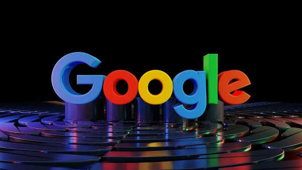
Google’s logo is instantly recognizable for its simple yet playful design. The use of primary colors (blue, red, yellow) with a secondary green on the letter “L” breaks conventional color rules, symbolizing Google’s unconventional and innovative approach. The clean, sans-serif font paired with bright colors reflects the company’s spirit of creativity, accessibility, and fun. Google’s logo embodies the brand’s mission to organize the world’s information and make it universally accessible, while also highlighting its willingness to experiment and push boundaries.
Apple
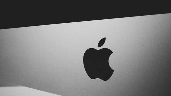
Apple’s logo—a minimalist apple with a bite taken out—is one of the most iconic in the tech world. The bite serves a practical purpose: it prevents the apple from being mistaken for other round fruits. Symbolically, it references knowledge, inspired by the biblical story of Adam and Eve, where the apple represents the fruit of knowledge. The sleek, simple design conveys innovation, elegance, and user-friendly technology. Apple’s logo embodies the company’s philosophy of combining cutting-edge technology with intuitive design to empower users.